使用CSS创建漂亮的边角
CSS 圆角不仅限于基础的 border-radius,还能通过百分比实现完美圆形。进阶玩法中,利用伪元素配合 box-shadow 可制作独特的切口角,而 clip-path 结合 polygon 函数,则能轻松裁剪出复杂的凹角效果。掌握这些技巧,能让界面设计摆脱单调,更具视觉张力。
1. 使用 border-radius 属性
border-radius 是创建圆角的基本 CSS 属性,也是非常有用且常用的一个属性。它允许你将元素的直角边框转换为圆角。这个属性可以应用于任何具有可见边框或背景的 HTML 元素,包括盒子模型中的内边距和边框。 border-radius 可以接受不同的值来控制各个角的曲率,这里是一些主要的用法:
单值
当只指定一个值时,这个值将被应用到所有的四个角:
div {
  border-radius: 10px;
}
这将使所有四个角都有 10 像素的圆角。
双值
当指定两个值时,第一个值将应用于水平方向的圆角半径,第二个值应用于垂直方向的圆角半径:
div {
  border-radius: 50px / 20px;
}
这将产生椭圆形的角,水平方向的半径为 50 像素,垂直方向的半径为 20 像素。
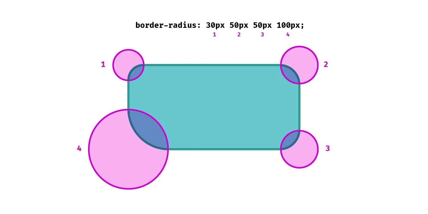
四值
当指定四个值时,它们分别对应四个角(顺时针方向):top-left, top-right, bottom-right, bottom-left:
div {
  border-top-left-radius: 10px;
  border-top-right-radius: 20px;
  border-bottom-right-radius: 30px;
  border-bottom-left-radius: 40px;
}
这将使得左上角有 10 像素的圆角,右上角有 20 像素的圆角,依此类推。
每角单独指定
也可以为每个角单独指定圆角大小:
div {
  border-top-left-radius: 10px;
  border-top-right-radius: 20px;
  border-bottom-right-radius: 30px;
  border-bottom-left-radius: 40px;
}
也可以使用 border-radius 为所有角设置不同的椭圆弧:
div {
  border-radius: 60px 40px 20px 10px / 21px 49px 27px 7px;
}
百分比
除了像素值之外,border-radius 还支持百分比值。百分比值是相对于边框框的宽度和高度计算的:
div {
  border-radius: 50%;
}
当应用于正方形元素时,这将产生一个完美的圆形。 还有一种方法设置正方形元素为圆形的方法:
div {
  border-radius: 9999px;
}
tailwindcss 用的就是此方法
border-radius 属性在所有现代浏览器中都得到了很好的支持,但在一些旧版浏览器中可能需要使用前缀(如 -webkit-, -moz-, -ms-, -o-)才能兼容。
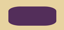
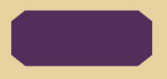
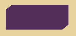
2.切口角
除了 border-radius 属性之外,还可以利用:before 和:after 伪元素来创建角点,方法是将第二个元素沿着原始父元素一起呈现。box-shadow 属性让这些伪元素创建不同类型的角。 使用此方法时,只能更改长方体的一侧或两侧。
使用:before 而不是:after 来避免添加内容后的布局问题:
div:before {
content: "";
position: absolute;
margin: -20px;
width: 40px;
height: 40px;
transform: rotate(45deg);
background-color: black;
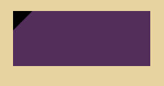
}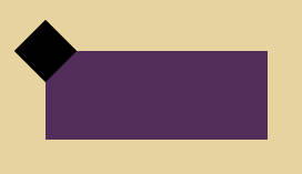 然后,在框上设置 overflow:hidden 以隐藏其子元素的溢出部分。
div {
/* 其他样式 */
overflow: hidden;
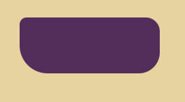
}使用 box-shadow 填充背景
div:before {
  /* 其他样式  */
  box-shadow: 0 0 0 250px #522d5b;
}
接下来,在伪元素周围创建了一个没有任何模糊效果的大阴影(使用第三个 0 参数设置),得到了它周围元素的放大副本。由于框中的 overflow:hidden,它外面的任何东西都被隐藏了:
 最后,从框和伪元素中删除背景颜色。阴影颜色在 box-shadow 属性中设置(在此例中是#522d5b),覆盖了盒子元素区域,并被渲染为盒子的背景层:
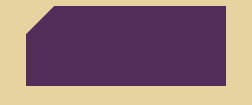
div:before {
  content: "";
  position: absolute;
  margin: -20px;
  width: 40px;
  height: 40px;
  border-radius: 50%; /* new */
  box-shadow: 0 0 0 250px #522d5b;
}
也可以使用:after 伪元素来设置两个角的样式。
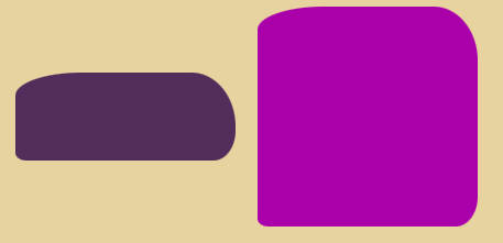
3.clip-path 属性
clip-path 属性决定在元素中显示哪个区域。可以将其与 polygon()函数一起使用,以创建凹口角(或具有复杂值的任何其他东西)。
div {
  position: relative;
  width: 200px;
  height: 80px;
  overflow: hidden;
  background-color: #522d5b;
  clip-path: polygon(
    0 20%,
    10% 0,
    90% 0,
    100% 20%,
    100% 80%,
    90% 100%,
    10% 100%,
    0% 80%
  );
}
一个有四个缺口角的元素:
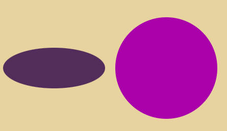
可以使用以下多边形定义仅为长方体的两个对角顶点创建凹口角:
div {
  position: relative;
  width: 200px;
  height: 80px;
  overflow: hidden;
  background-color: #522d5b;
  clip-path: polygon(0 20%, 10% 0, 100% 0, 100% 80%, 90% 100%, 0% 100%);
}
带有两个缺口角的元素:
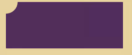
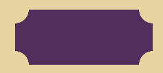
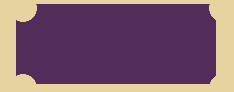
4.mask 属性和 radial-gradient()函数
如果需要挖取所有四个角,可以使用新的 CSS mask 属性(基线 2023 支持)和 radial-gradient()函数:
div {
  position: relative;
  width: 200px;
  height: 80px;
  background-color: #522d5b;
  mask: radial-gradient(20px at 40px 40px, transparent 98%, black) -40px -40px;
}
梯度函数在黑色背景上创建一个透明的圆圈。然后使用-40px -40px 掩码定位将生成的圆推到左上角,以将梯度圆区域均匀分布到所有四个角
 同时,可以调整上述定位和大小调整值,并生成不同的铲角:
div {
  position: relative;
  width: 200px;
  height: 80px;
  background-color: #522d5b;
  mask: radial-gradient(14px at 40px 40px, transparent 98%, black) -33px -36px;
}
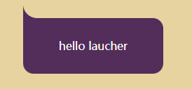
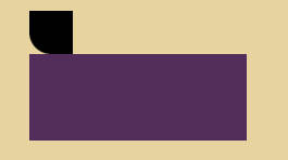
5.消息气泡角
创建伪元素,之前的长方形 div 不需要 overflow: hidden 方法。不然伪元素会隐藏
div:before {
  content: "";
  position: absolute;
  top: -40px;
  left: 0;
  height: 40px;
  width: 40px;
  border-bottom-left-radius: 50%;
  background-color: black;
}
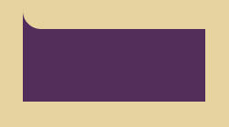
下一步是填充伪元素之间的小部分并删除背景色。可以使用 box-shadow 属性来做:
div:before {
  content: "";
  position: absolute;
  top: -40px;
  left: 0;
  height: 40px;
  width: 40px;
  border-bottom-left-radius: 50%;
  box-shadow: 0 20px 0 0 #522d5b;
}
这种类型的设计非常适合语音气泡。
div {
  position: relative;
  display: flex;
  align-items: center;
  justify-content: center;
  width: 200px;
  height: 80px;
  background: #522d5b;
  border-radius: 0 15px 15px 15px;
  color: white;
}